Marketing Guidelines
The key brand resources and fundamentals to get started with our brand. Find logos, colors and typography specs. All designs have to be approved by Krista
At LIAM we only use one type of our logo which is the “Main Logo” – white text with the signature orange colour. This is our brand logo, which should not be modified.
Using the logo over photographs, illustrations, and patterns is acceptable, as long as there is enough contrast to clearly distinguish the logo from the background. To further our focus on simplicity, the logo must only be presented how it is above. Remember, less is more!
These are the main colours that we use at LIAM. These bold colours add energy to our brand, while highlighting the simplicity of our designs.
Jaffa – #f76c0b
Is primarily used for addressing the word LIAM in documentations, so whenever we talk about LIAM the colour should be highlighted in the Jaffa Hex Code.
Royal Blue – #1a2b56
Royal Blue is used to address backgrounds for title pages, cover pages, website header and footer colours.
Black – #000000
Black should be used for texts, such as email, letters, website content etc.
Alabaster – #FFFFFF
Alabaster (white) should be used as the default background page colours for documents with black texts on them. Such as letters, website background etc.
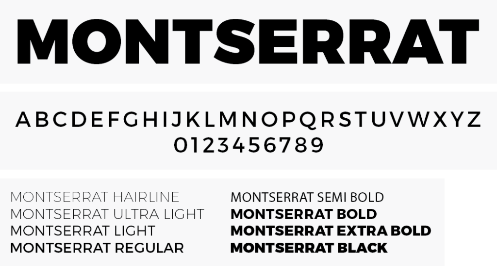
We use Montserrat as our body font because of its sleekness. The same font is also used for our logo but we use the bold version of Montserrat. Used for all communication materials, including website content, print materials, and digital media.
LIAM Construction’s voice and tone are important aspects of our brand personality. Our voice should always be professional, confident, and knowledgeable, while our tone should vary based on the communication channel and the intended audience.
Voice
Our voice is how we communicate with our audience, and it should reflect our position as experts in the construction industry. We strive to be professional, authoritative, and knowledgeable in all of our communications.
Examples of our voice:
“As experts in the construction industry, we pride ourselves on delivering high-quality projects that exceed our clients’ expectations.”
“Our team of experienced professionals has a deep understanding of the construction process, from design to completion.”
“At LIAM Construction, we believe that quality is paramount. We never cut corners or compromise on the integrity of our work.”
Tone
Our tone is the emotional aspect of our communication, and it should vary based on the context and audience. We aim to be friendly, approachable, and conversational in our tone, but we also understand the need to be precise and technical when discussing complex topics.
Examples of our tone:
For a prospective client: “Hey there! Thanks for considering LIAM Construction for your project. We’re excited to work with you and bring your vision to life!”
For a technical report: “Our team pays close attention to every detail, ensuring nothing is overlooked. This level of precision allows us to deliver projects of the highest quality.”
For a social media post: “We love sharing updates on our latest projects and industry news. Follow us to stay up-to-date on all things LIAM Construction!”
Overall
Remember, our voice and tone are critical components of our brand personality. By maintaining a consistent voice and tone across all of our communications, we can build trust with our audience and establish ourselves as leaders in the construction industry. Less is more.
| Do’s | Don’ts |
|---|---|
| ✓ Use our official colors (Jaffa, Royal Blue, Alabaster, and Black) in all marketing materials and communications. | ✗ Use colors, fonts, or graphics that are not part of our official brand guidelines. |
| ✓ Use Montserrat font for all text, except in cases where a different font is necessary for design purposes. | ✗ Don’t use gloriyfing words that are complicated, less is more. |
| ✓ Keep our voice professional, authoritative, and knowledgeable. | ✗ Make promises or guarantees that we cannot deliver on. |
| ✓ Vary our tone based on the context and audience, but always aim to be friendly, approachable, and conversational. | ✗ Use low-quality images or graphics that do not align with our brand personality. |
| ✓ Use high-quality images and graphics that align with our brand personality. | ✗ Modify our logo in any way, including changing its colors, proportions, or design. |
| ✓ Include our logo on all marketing materials and communications. | ✗ Stray from our brand guidelines in any way, as this can harm our brand consistency and integrity. |
At LIAM Construction we want to make sure our marketing guidelines are followed in all aspects on the company. Including marketing materials. It’s important that you don’t use glorifying words or words that are complicated. Use simple language. Less is more.
BAD EXAMPLE:

GOOD EXAMPLE:

Add Business Card design here.
